Charming Simplicity: Batman Storyboard by Mike Thomas


This is a short storyboard sequence done for fun by Mike Thomas. To me, it’s a perfect example of how, when you know what you’re doing, you can create a great storyboard using a very limited number of panels. This scene has only 26 panels. The drawings are kept very simple, and by setting the scene in the Bat Cave, Thomas barely needs to draw any backgrounds at all, instead getting away with a quick dark tone.
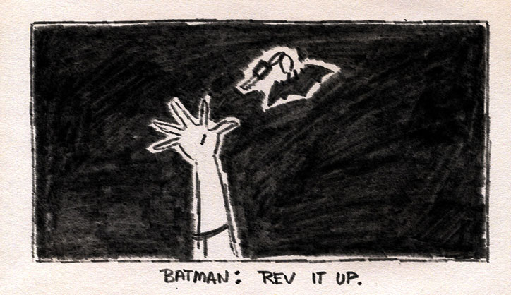
As you might notice, these boards are done traditionally, with pencil or possibly china marker on paper. There are digital tones in some of the panels, to clearly separate the characters from the background, but there are no fancy blurs or effects, the animation is kept to a minimum and there are no complicated camera moves. It is just simple but very solid visual storytelling.
In a time when students and upcoming storyboard artists often try to impress with flashy technical tricks, a sequence like this feels like a breath of fresh air. Despite being short and simple, it’s a complete scene with a clear beginning, middle, and end. There’s a central conflict -the riddles that need solving- and it smoothly sets up the rest of the story. It is very charming, the drawings are solid and have lots of appeal. The acting is terrific: there is a clear difference between the young eager Robin and the calm, in-control Batman. This dynamic between the characters works really well, which makes this scene very entertaining.
The cinematography, though deceptively simple, is solid. It starts with a typical, wider, establishing shot, then moves into a shot-reverse shot for the dialogue. As the conversation progresses, we get more two-shots, and once the riddles are solved, there is a change in direction, where we cross the 180 line without causing confusion. Not bad for only 26 panels!
This sequence shows how much you can learn from doing traditional storyboards. Storyboarding on paper forces you to keep things simple. You’ll likely end up with fewer panels, which means that the panels that you do have better work. Because you’re not able to reuse backgrounds, more likely than not you will end up avoiding overly complex sets and rely on clean, readable designs instead. It’s a bit like cooking: a great chef can make a delicious dish using just a few simple ingredients, while beginners often try to impress with overly complex combinations.
About the artist: Mike Thomas is a bit of a mystery to me. I love his work and have been following him online for more than 15 years now. But he doesn’t share much about himself or the projects he’s worked on. He describes himself as an “artist, comic book artist, writer, illustrator” and I’m not even sure if he’s actually worked as a storyboard artist. You can find him on Instagram and he also has a blog. He ran a Kickstarter for his graphic novel Astraphobia, which unfortunately wasn’t funded, but he’s currently running a campaign to fund a collection of his life drawings.

