I love story games like ‘Next 5’. The game where you take an image and draw the next five shots. There are variations on this specific game. Some people start with a photo, others use illustrations or concept art. Some people redraw the given image, others include the original photo or artwork. There are people who do the next 6 shots, sometimes people use this same idea but do an entire sequence.... The storyboard that introduced this game to me was this storyboard by Emma Coats. At the time Emma was working as a story artist at Pixar. You might know her from the 22 Pixar story rules. She used to have a blog full with great posts about visual storytelling, but unfortunately that blog is no longer online.
At first glance this short 6-panel sequence is fun to look at, but it is worth it to take a closer look. Because really this board is a masterclass drawing for storyboards. It has great examples of some of the most valuable techniques in a story artist’s arsenal.
1. Keep it simple
This first panel, which really is a copy of the photo she used as a starting point, is a great example of the limited amount of detail you need in a storyboard.
The hand and the birds are the focus of this panel. If we look at the original photo, we see Notre Dame in the background. Emma chose to incorporate this element, but notice how quickly she seems to have drawn it. She’s not too concerned with the building. All we need from the background is to give us a hint of where we are.
In the photo, the background has some darker areas: especially in the windows. But Emma didn’t use any tone there. The only tones are used in the sleeve and the sparrows: the focus of our attention. By applying tone in this way they clearly stand out. To further separate the foreground from the background she used a light grey line for the background. Notice that she didn’t feel the need to blur the background. That’s easy enough to do, but by leaving out detail and tone, and by using a lighter colored line than the foreground, the effect of the background being out of focus was already achieved.
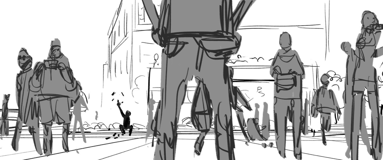
2. Contrast
Our eyes are automatically drawn to the area with the biggest contrast. And, you can't get a bigger contrast than back on white. Here Emma blocks out the man and the sparrows in a solid black. Notice how she also didn’t draw the background behind him in the panel. She frames the black figure against plain white. She also used grey lines again, this time for the people in the foreground. Again giving these elements an out-of-focus feel without needing to use a blur.
She also used the rule of thirds, placing the man exactly on the first vertical axis and just underneath the bottom left intersection.
This is our establishing shot, the buildings in the background have a Parisian feel. This panel is also a great example of perspective for storyboards. Aspiring story artists often struggle with perspective and the required level of detail. Notice how there is depth to the background, the building is drawn with a two point perspective, making it more dynamic than when we would have seen only a single side of the building. But again, keep it simple. If you look carefully you can also see that the perspective of the buildings and the grid on the ground don’t really line up. You don’t have to draw a perfectly accurate perspective. If it feels good, it works.
3. Foreground/midground/background
Another establishing shot, just in case people didn’t recognize Notre Dame in the first panel here it is shown with its distinctive two-tower facade. The tones in the panel form a very clear separation between foreground, light grey, mid-ground, dark grey, and background, white.
Try to have a distinctive foreground, midground and background in your storyboard panels. You don’t always need all three (in fact only two of these six panels do) but it is a crucial concept when drawing storyboards, especially in wider shots. By having these three separate layers in your panels you create depth, and this makes your drawings feel cinematic. Note how making these different planes overlap creates an even greater feeling of depth.


Notre Dame in the background is again drawn quick and with little detail. Yet another example of grey line and a lack of tone creating an out-of-focus effect. But also notice that, rough as it is, there is some added depth by also showing the side of the tower. If Emma had left that out the background would probably have felt too flat.
The point of attention in the panel is the little girl. Like in the previous panel she is positioned using the rule of thirds. The white in her eyes against the black line also creates contrast, making sure our eyes are drawn there. It’s also interesting that the mid-ground has a darker tone than the foreground. Usually the elements closest to us are the darkest, things get lighter as the get father away from us (atmospheric perspective). By making the foreground lighter our eyes go to the girl first, following her line of sight we are then lead to the man with the sparrows.
Again this panel is a brilliant example of the minimalistic use of detail that is required for storyboards. Look at the way she drew the guy’s fist for example. This is a storyboard, it needs to be clear and compelling but it doesn’t need to be perfect. Still this panel feels very well drawn. Emma Coats is a pretty amazing story artist, it is clear that she knows exactly when she can get away with a rougher sketch and when more detailed drawings are needed.

4. Frame within a frame
Another great trick to guide the eye. By having a frame within the frame of a storyboard panel our eyes are automatically drawn there. You can use many different elements to create this effect. Windows or doorways, streets, car tires, picture frames or, as seen here, characters. By filling the people in the foreground with a a darker tone, our eyes are kept within the created frame. We are looking at the man, just as the girl is.
Making the man point to his closed fist is an example of strong visual storytelling. The story could work pretty much the same way without the man being aware of the girl. But by having him look at her, making a connection with her and through her with us, we are drawn deeper into the story. The pointing finger leads our eyes even more. If you point to something you can be pretty sure that’s where people will look. You can use pointing fingers but also a look (as in the previous panel) or other elements. A nose for example has an arrow like shape, other elements you can use are pointy leaves, actual signs, shards, rocks, etc.

5. It’s all about the eyes
A character’s emotion is mostly in their eyes. Because the way we are programmed as a species our eyes will always seek out other people’s eyes. By making the eyes white against the light grey tone used for the rest of the character they really stand out to us. The character, again on a third by the way, is on the right side of the frame. Consistent with the previous two panels. From the second panel on it was established that the man with the sparrows is screen left, and previous two panels show us that the girl is on the right side of the panel.
As for the gesture, the character has a lean to her. She isn’s drawn straight, which would have made the panel less dynamic. Even though it is a still drawing without any motion blurs or effects like that, we still have the feeling that the girl is moving. The suggested movement, in combination with her eyes looking the other way create the effect of a glance, we feel her eyes move towards the man’s fist.
6. All together now
The final panel is a perfect combination of techniques. The composition, once again is using the rule of thirds. The more detailed drawn hand frames the sparrow’s head. The white against grey makes the sparrow stand out. Its black eyes against the white background form the point with the highest contrast in the panel. Notice the two birds on the right, point towards the sparrow we’re supposed to look at.
And again there is a charming simplicity to the drawing. Emma obviously took some time to get the hand right but she doesn’t waste time on useless details. This is a very confident way of drawing. To me knowing exactly what you need to draw and what can be left out is the sign of great draftsmanship. If this was an illustration, or a comic book she probably would have erased the construction lines that can still be seen, but because this is a storyboard she didn’t bother: clear not clean.
I also find it interesting that there is no background at all. From the angle of the camera we should probably see some of the hedge in the background, but it isn’t necessary for the panel to tell its story. There is a light grey tone but I believe the only reason it is there, is because Emma wanted to have the sparrow in white to get that contrast around the eyes. And that wouldn’t work if the sparrow’s head was positioned against a flat white background.
So there you have it, a storyboarding masterclass in only six panels! So many great examples of storyboarding techniques in such a seemingly simple storyboard. If you want to get into storyboarding and are curious what kind of drawing skills are required, study this sequence and work on mastering those techniques. But don’t forget to have fun along the way, it will show in your work!