Blade Runner 2049 composition studies by Matt Jones
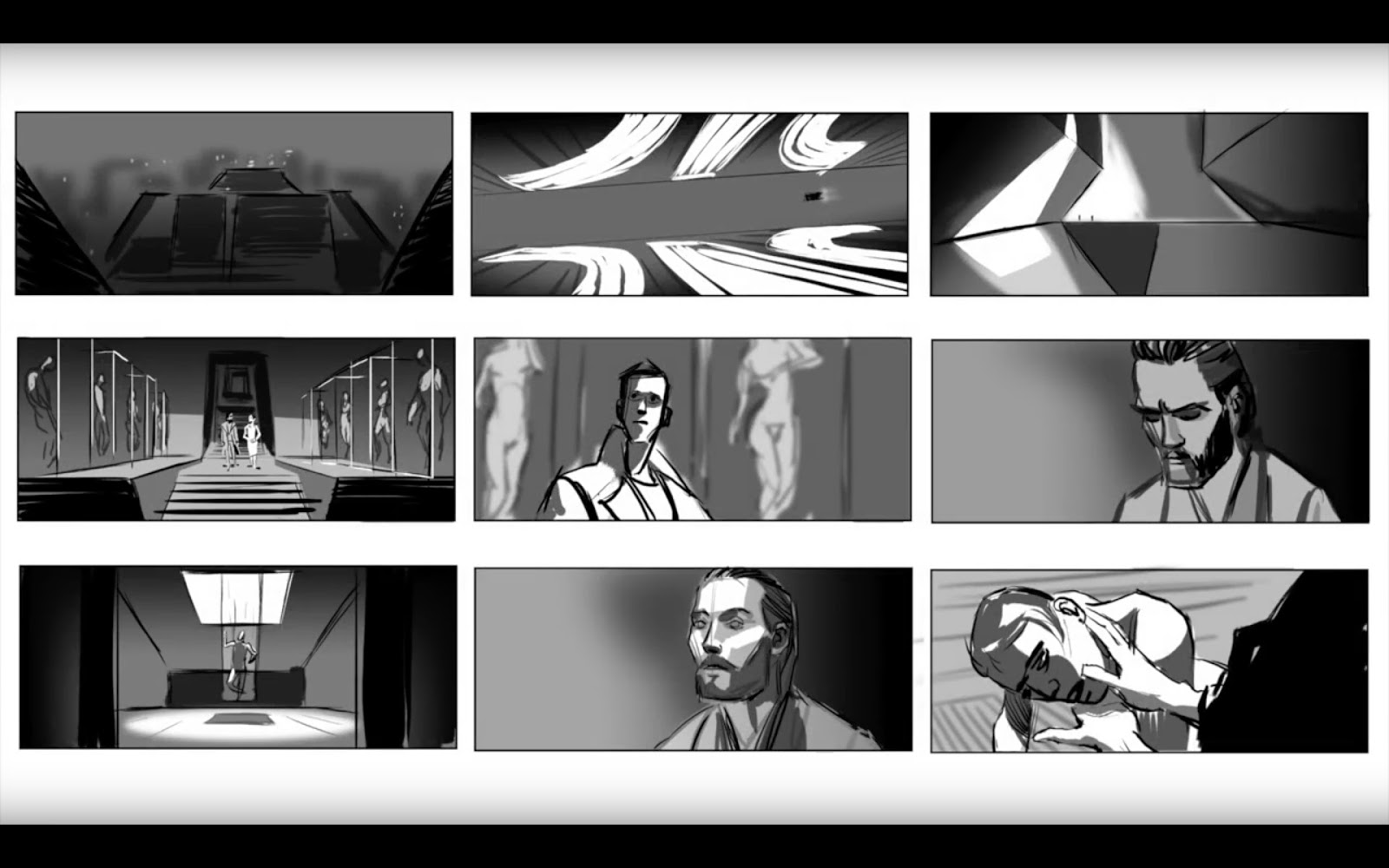
On his YouTube channel Matt Jones has been sharing videos of him doing digital composition studies of Roger Deakins cinematography in the Blade Runner 2049 Trailer. You can watch them here and here.
In these videos Matt also shares some of the thoughts with which he approaches these studies. I found those very interesting. You get to see how he looks at these images, what information he focuses on and how he builds up his panels. It’s like you can actually read his thoughts.
Most of these captions are very specific to the frame he is working from, but some of his remarks can also be read as more general thoughts on composition and storyboarding.
Now, since I’m such a nice guy, I went and wrote all of them out for you! You can read all of them below:
Screen-grab the new trailer . . .
Make a template to match the screen ratio of the film
Don’t TRACE the images. Try to match the composition by EYE
Holding down SHIFT while drawing snaps your brush to the horizontal (or vertical)
Simple gradient to suggest atmosphere
GAUSSIAN BLUR filter to add depth
High angle- the extreme perspective distorts the ATARI logo
The perspective lines draw the eye to the moving element
The film-makers are not afraid to have the moving elements of a shot TINY in frame
Horizon line placed just below the center of frame
Many of the wide shots in this trailer are symmetrical while character shots are asymmetrical
Again, the point of interest, the figures, are TINY but read because they’re placed at the point of HIGH CONTRAST
Again, a symmetrical composition with the horizon line just below the center of frame
No need to draw EVERY step- just SUGGEST steps
Isolate background and ‘knock it back’ by blurring and reducing the opacity
Use light grey to highlight those figures
Use white for the highest point of contrast: the female figure
Blur background elements and bring down opacity so the character has the highest contrast values
Again, the character is framed off center, high angle and close
Off centered framing & minimal background focuses on the character
VERY minimal background; it’s all about the character
Symmetrical composition, horizon line on lower third of the frame. Surreal image; reminds me of Jonathan Glazer’s ‘Under the Skin’.
For perfect ellipses use the ELLIPSE tool!
Again, character framed screen right with VERY minimal background
High angle, over the shoulder, fore-ground figure ‘owns’ the frame
- - -
Rough in perspective lines as a guide
Establish foreground element (heaviest black)
Establish character (focal point of shot)
Elements in background are lighter
Always remember CONTRAST in values
Background elements should not be distracting
Distant lights can be simple
Sci-fi establishing shot! Amazing architecture
Rough in the perspective (high angle)
Block in tonal shapes
A suggestion of background buildings adds DEPTH
Blur gives more depth
Low contrast in this shot since it seems to be obscured by weather
2 shot but focused on foreground character
Background detail sparse and blurred
Block in the lighting simply
Insert shot, high angle- over the shoulder, close on gun
Focal point of shot is the hand and the weapon
Foreground shoulder & background blurred. Shallow depth of field
Deakins uses simple highlights to bring elements forward
Single shot, high angle and close
Very simple background elements
Block in simple tone
With linework think about drawing SHAPES and PLANES. Not overly detailed.
Keep lighting simple and clear
Establish perspective. Wide shot, low angle
This is a vertical camera move so the cropped holographic ballerina looks a little odd here
Use blurring and lower opacity for simple hologram effect.
Horizon appears to be almost on the actor’s eyeline
Also, a shot behind an actor’s head strangely puts us in their shoes
Deakins loves to use silhouettes!
Again, keep background elements simple.
Use shapes, contrast and overlapping forms to suggest DEPTH.
The BLUR tool is your friend- as long as it is used to contrast with something in SHARP focus
It doesn’t take much to SUGGEST figures. Umbrellas help too!
Wide shot. Horizon appears to cut the frame in half giving a symmetry to the shot
Rough in a perspective guide
Block in main planes: foreground, mid-ground figures
I tend to always use grey as a base color for most boards
Again, the background only needs as much detail to SUGGEST an environment. Don’t distract from the point of interest- the FIGURES
Adjust scale of figures. Deakins is not afraid to have tiny figures in frame
Notice all lines of perspective lead the eye to the characters
Same scene. Medium shot. Horizon central but technically a low angle.
Block in the shapes- it’s easy in silhouette!
Background can be loose. Focus is on the characters.
Linework just needs to communicate ‘two figures look at each other’
Silhouette but there is some detail in there; subtle light on the faces
Subtle highlights to bring them forward

